I just realized I have been too busy to update my portfolio for some time. Since I’m spending the slow-down of the holidays tuning up my stuff I thought I would share. (I’m trying to get better about it!) Here are the latest clients I have helped with their web presence: Garcia How & Associates are a
Recently launched: TSM Management Inc, TSM Consulting & Capital LLC & The McMahon Foundation Design brief: This client came to me with three different business he needed sites for. We ended up combining all three businesses into one website, with different color templates to denote each main section. He really likes Notre Dame so we took their
I am almost always pro-responsiveness when I create a website for a client. Is it extra work? Yes, yes it is. Is it a pain in the ass to test on all devices? Absolutely. However, I really do believe it’s the right way to design a site right now and for the future. Now, that’s not to
So you want to build a website… Get Started on the Right Foot: Planning Your Website – Zoe Rooney
I’ve collected a couple links to get you pointed in the right direction for writing your about page. Together we can make it great! Showcase of Creative and Great Examples of About the Team Pages 21 Inspiring About Pages How to create a great ‘about’ page
I’m not a big subscriber to following trends when building websites but it doesn’t hurt to be aware of what is current. Below are some links that point you to what’s new and what is on the horizon. Browsing through these can help you put your finger on what you like and what you don’t
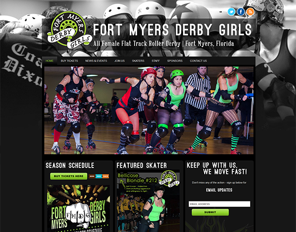
Recently launched: Fort Myers Derby Girls Design brief: This site was built for Fort Myers’ amazing roller derby team. My goal was to make it eye-catching & high-energy – just like the team. I played around with the large photo as the site background & the design pretty much took shape from there. I love
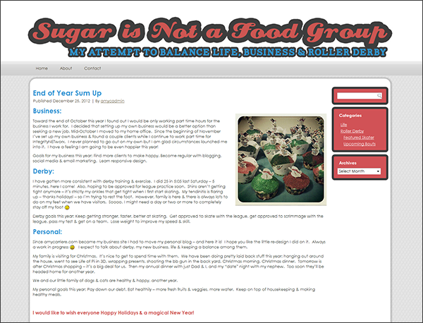
Recently launched: SugarisNotaFoodGroup.com Design brief: When I started my small design firm my site AmyCarriere.com became strictly business & displaced my personal blog. I finally was able to spare the time to freshen up the design & get it set up at SugarisNotaFoodGroup.com. This is where I write about personal stuff: roller derby, running my
I often see a lot of lists of websites on the design blogs I read. A couple of examples from the past couple days: 21 Beautiful Examples of Dark Colors in Web Design, 35 Beautiful Textured Web Designs. I pin the sites that catch my eye on Pinterest & I tend to tweet the lists
Recently launched: CStrohmeyer.com Design brief: Built in conjunction with & in a similar style to FaceLift.md, it’s sister site. This is mainly an information site for prospective clients to find out more about the dermatology practice & services they offer. They also have a shopping cart so their clients can order their products online.


