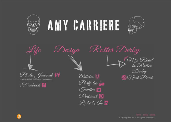
Recently launched: AmyCarriere.com’s (you’re on it!) home page Design brief: I was really having an issue with my blog. It was stressing me out that I hardly ever updated & my focus was all over the place. I needed to streamline to make it easier to upkeep and easier to keep up with. Before I
Here is a great article for designers out there of any type: Get a Thick Skin – Living with Criticism. One paragraph in particular I really appreciated: “It’s important to remember that it’s usually not personal when someone attacks you. You just happen to be the target of the moment. Show no emotion about it
Recently launched: FaceLift.md Design brief: Client needed a fresh site for his facial surgery practice. We also designed a complimentary site for his wife at Dermatology Specialists of Naples (soon to launch).
Recently launched: Porter Davis Real Estate Design brief: Client wanted a real estate site that had a Tumblr look to it & that they would be able to post to while on the go. Other than that he wanted to keep it simple – no real estate search or mortgage calculators filling up the home
Remember when everyone talked about “the fold”? As in, “We need to keep the important information above the fold.” And, “Visitors won’t see if it’s below the fold.” I’ve even had clients insist on having me design their entire site to show above the fold due to this paranoia. Well, at some point when I
Or more accurately: What do you want your website to get your visitors to do? I read this article today – You Design It, They Do It. It reminded me that you really need to define what you want your visitors to do before you even start to design. Do you want them to call
Release the Kraken. Click it. I’ll wait. . .. … This is an EXCELLENT example of a great marketing package. The product packaging is amazing – it alone makes me want to buy this product. But they follow the thread throughout all their materials – video, website, tie-in products. We do the same when a
Lately I have heard the word “clean” a great deal in design meetings. Other repeat offenders are “modern” and “make it pop”. Unfortunately, these terms can mean different things to different people. Just like bringing a photo with you to the salon to help illustrate what you mean by “reddish blonde highlights”, it is a
I wrote a guest post for IntegrityNETworx.com* earlier this week about single color background web designs. I decided I liked this minimalist approach & decided to try it on my own personal site – this one – since I needed to do some re-branding anyway. I want to divide my focus among my personal life, design
Line 25 had a showcase of Solid Color Background in Web Design the other day & it made me realize that I don’t think I have ever done a design where the content color & the background color were the same. It adds a very stripped down feel to a site and makes the content

